Alongside contrasting colors, a distinctive visual asset offers another way to drive strong visibility for your packaging design. It also speeds up brand recognition and decision-making.
What is a distinctive brand asset?
The concept of creating and leveraging distinctive branded assets is nothing new. The Coca-Cola bottle, Shell’s shell, the Camel camel, the purple Milka cow and Little Debbie are all examples of visual identity elements that have become distinctive brand assets.
The distinctive brand asset has resurfaced as a hot topic in recent years on the back of Byron Sharp’s book ‘How Brands Grow’. In his book, Sharp argues that brands should be distinctive, rather than differentiated. In many categories, brands aren’t very different from one another. Or they are only different on elements that are not as relevant to brand choice. Visual identity elements that are strongly and uniquely associated with a brand will, over time, create distinctive memory structures, which bring the brand top of mind in brand choice situations.
How do you know if your brand’s visual identity elements are distinctive? If consumers strongly and easily associate your asset with your brand, and do not confuse it with any other brand, then you have a distinctive brand asset. This can be researched of course: a simple de-branded, speed-of-association test will do the trick.
For many brands, their most – and often their only – distinctive visual asset is their logo. If this is true for your brand, then please love your logo. Nurture it, protect it, and make sure that it has a prominent and sizeable presence on your packaging design.
Choosing a brand asset for your packaging design
While it may take a lot of money, time and patience, there is value in developing distinctive assets other than your logo.
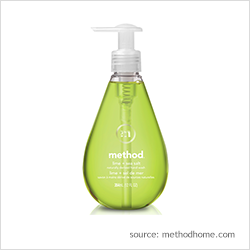
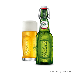
Go for brand assets that can be leveraged in both communications and packaging. For example, the M&Ms characters or Planters’ Mr Peanut can be used for both means, whereas George Clooney is only featured in Nespresso communications. Alternatively, a powerful way to create distinctive assets is through differentiated packaging structures, such as Method’s soap bottle, the Grolsch flip-top bottle, or Heinz ketchup’s original glass bottle.
A final point that you – and your design agency – will have to deal with is the need to find balance. The more space you allocate to a branded visual asset on your packaging design, the less space there is to communicate other key elements, such as the brand, its benefits, the reason-to-believe and the end-promise. Fitting all the various elements into a design and creating an order that makes sense to people can be a daunting task. But it certainly gives you the opportunity to think creatively!
More ideas for amazing packaging designs
We’ve pulled together nine best practices for creating powerful packaging into a whitepaper, which you can download below. Use these guidelines to self-assess your current designs, to design your own packaging, or to inform your design agency brief.
Plus, create, optimize and validate the strength of your design with the help of our PACT suite of research solutions. Contact us for information on our solutions and more packaging design recommendations.


