The PACT series part 3:
Using human visuals in your packaging design

Welcome to the 3rd article in our PACT blog post series: a collection of blog posts that dive into the principles and best practices of effective packaging design. Today, we’re discussing the use of human imagery in packaging design and how it can help drive positive perceptions of your brand and product.
The power of human imagery
In our article, 8 elements that should feature on your product packaging design, we mapped out the necessary ingredients to create successful packaging design. Did you know that incorporating human visuals can help follow the recipe?
In most cases, human visuals serve one of two functions in packaging design:
Reason to believe: often illustrated through visuals showing humans using the product, emphasizing its ease of use, safety, etc.
Emotive end-promise: typically conveyed through increased beauty, improved health or happiness, etc.
Human visuals on packaging add credibility to the product and create a memorable impression.
Even when it comes to ads, there is a positive correlation between including human visuals and
ad performance.
Backtracking to pack design, human visuals can help drive premium perceptions. The previous article in our PACT series goes into more detail about driving premium perceptions through packaging design. Read it here.
The importance of hierarchy
This messes up the proper and logical order of first understanding what the product is and what it has to offer, before understanding as to why one should believe that and what its end-promise is. To combat this reversal of hierarchy, it’s important to establish an appropriate prominence of design elements.
Let’s take Philips’s Sonicare AirFloss design as an example:

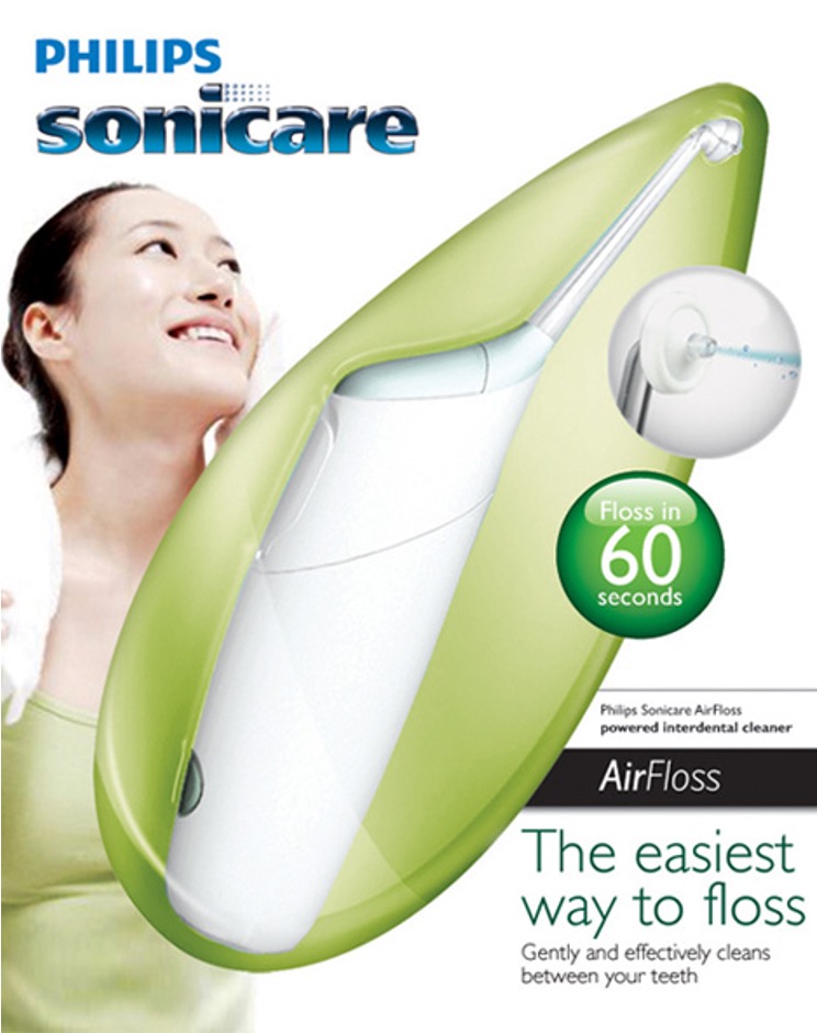
Upon looking at the first packaging design (left)(top), my eyes are immediately directed to the visual of the woman, which signals a promise of beauty and health – but I have no clue what the product is yet.
When I look at the second design (right)(bottom), however, the visual of the product itself is much more prominent, revealing the type of product and its functional benefits. While the woman is still visible, she is positioned in the background – and thus, the second point of focus – of the design, establishing the right hierarchy. The second design illustrates the product and its functional characteristics before its end-promise.
Thanks to this optimum hierarchy, the second design generates a purchase intent of 41% – a notably higher percentage compared to the ‘reversed hierarchy’ design on the left, which has a purchase intent of 34%. This goes to show that having a design with a sub-optimal hierarchy can have serious negative commercial impact (lower sales).
Now that you know about the potential of using human visuals and the importance of getting the hierarchy right, it’s time to elevate your packaging design. Our PACT solution suite can help set you up for success – learn more about our pack testing capabilities here.


