9 best practices
for creating powerful packaging designs
Packaging design is not just about standing out from and winning against your competitors on the shelf. Your packaging is also the primary embodiment of your brand. It is an always-on broadcast of your brand that is leveraged across all touchpoints and media. Therefore, it pays to invest time and effort into creating a powerful packaging design.
We at MetrixLab, have garnered many insights based on our research, collective experiences, and benchmark database to put forth nine best practices for powerful packaging designs. The following nine practices stem from broader themes of visibility, communication, and persuasion.
Visibility
One of the first steps to ensuring your packaging remains impactful and powerful is visibility. Amidst a sea of competitors, it is vital that your packaging can catch your potential consumers’ attention.
1. Use color contrasts for a design that stands out from the crowd
A simple yet effective way to bring your brand to the spotlight and boost shelf visibility is through color. Specifically, contrasting colors. Choose a dominant color for your branding and packaging design that contrasts with category codes and competitor colors. Although going a different route with completely disruptive colors can lead to big rewards, there’s always a risk of backlash. In cases like these, it’s crucial to test your packaging with a design test first. This may help you find the balance between findability on the shelf and disruption so your brand can stay consistent but still remain unique.
2. Nurture distinctive visual assets to strengthen your brand identity
What comes to mind when you see the picture of a half-eaten apple. Probably not the fruit, but the mega tech giant, Apple. Over time, many brands have transformed simple icons into their distinctive brand assets that people can identify anywhere. When your consumers can strongly associate and pick out your brand simply through icons and symbols among multiple others, that indicates that your brand asset is distinctive. Just take Red Bull, a leading energy drink brand. Their iconic logo with two red bulls facing each other have become a major source of recognition for their brand that efficiently develops their brand identity.
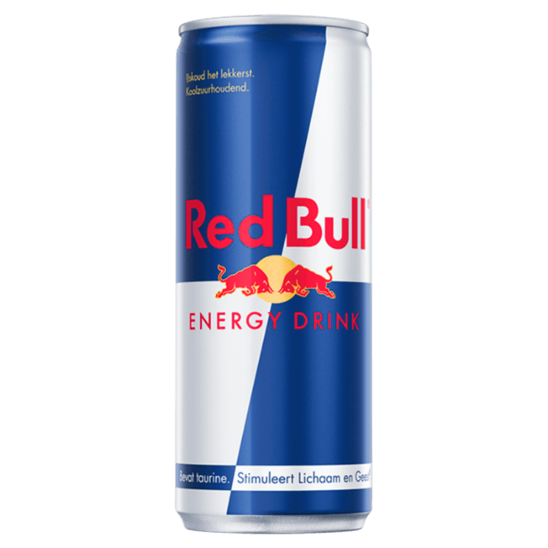
Source: jumbo.com
However, a logo is not the only brand asset you should nurture. Ensuring your packaging and communications can stand out and balance each other is crucial. While it is true that fitting all your visual elements into a balanced design and order is daunting, it certainly pays off!
3. Unite the line and differentiate the variants for optimal brand recognition
Like so many of our other packaging design best practices, line unification and variant differentiation is a matter of trade-off and balance. On the one hand, you want consumers to distinguish between your variants easily. On the other, you want them to quickly recognize that all the variants belong to the same line and brand. While line unification creates an impactful brand block on the shelf that’s hard to miss, variation allows consumers to understand the different products and pick their favorites. Thus, maintaining a steady balance between the two is vital. An excellent example is that of Coca-Cola and their old and new design ranges. While the older lineup was slightly disconnected in terms of text, font, and design, their new range is much more cohesive yet distinctive as a brand with multiple variants.
New
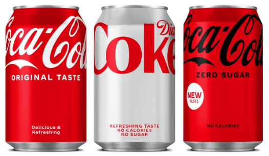
Old
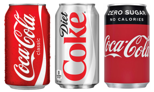
Source: marketingweek.com | pngitem.com | citypng.com
Communication
Great! You’re packaging has grabbed your consumer’s attention. Up next: The need to communicate what your product is all about and why they should buy it.
4. Include all the recipe ingredients to communicate transparently
The key ingredients for a successful packaging design are:
- Category or product type
- Brand
- Variant: for products that offer more than one option
- Functional benefit(s): what the product does
- Reason(s)-to-believe: why the consumer should find the claimed functional benefits credible
- Sustainability communication: Consumers are becoming increasingly conscious of sustainable practices. It is crucial then that your brand can reflect these practices in your packaging.
- Emotive end-promise: how the functional benefit fulfills a higher need
- Call-to-action: why the consumer should buy it now
- Size, weight, content details, etc.: practical information the consumer needs to know
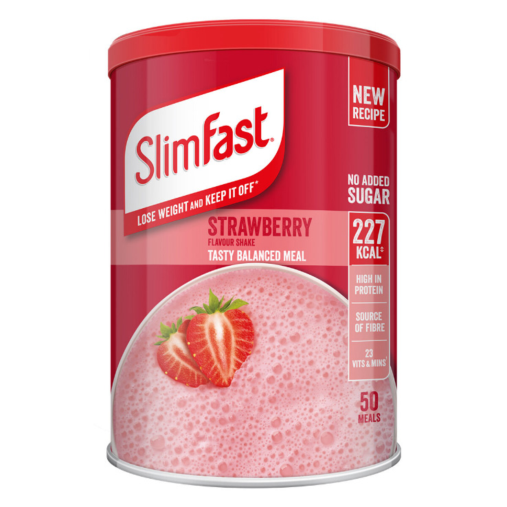
Source: costco.co.uk
However, our research has found that most brands, in an effort to be minimalistic, fail to include all these ingredients in their packaging, leading to lost opportunities. The risk with such a minimalist design approach is that the more elements you leave out, the less likely consumers are to ‘get it.’ Moreover, visualizing the end promise enables better persuasion, powerful suggestion, and strong emotional resonance with the brand. Here, Slimfast is a brilliant example of providing an optimal level of information to their consumer while balancing out design.
5. Follow the recipe to create a logical flow
Simply having your recipe at hand does not end the job. Adding the ingredients logically warrants that your end product reaches its full potential. Our advice for layouts is simple:
- Brand before function and variant
- Function before emotion
As people often start their visual search pattern from about 20-30% below the top, feature your brand logo in a position that utilizes this space. Below the logo, add product category, type and/or variant. Use the space underneath to communicate the functional benefits, reason(s)-to-believe and an (emotive) end-promise. And consider using the space at the very top for a call-to-action
6. Augment your message through congruent elements for stronger consistency
Congruence is a major aspect of any powerful packaging design. Be it the label design, text, or packaging structure, they all work in harmony to communicate functional and emotional benefits to the consumer. Thus, the cohesion between the visual (images, logo, colors) and the structural (shape, materials) conveys a stronger collective message about your brand. Dreft’s unique bottle shape and design are a classic example of leveraging consistency to develop congruent elements.
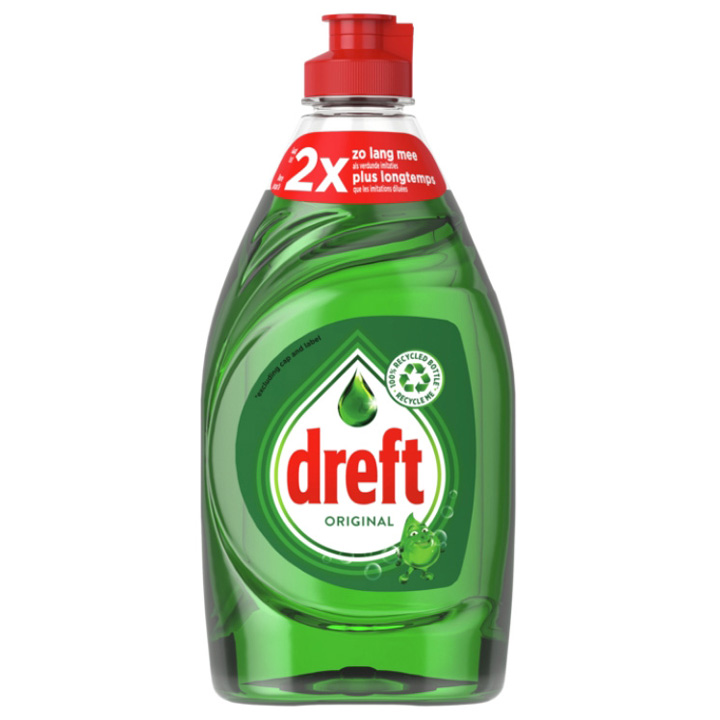
Source: amazon.nl
7. Establish the right value perception to convey your product’s worth
Alongside the price tag on the shelf, your packaging design reinforces your value positioning as an economy, mainstream, or premium brand. You should, thus, align your brand with your price positioning. Most often, brands aim for a premium perception. Successful premium designs from our database tend to use darker colors. Since the pandemic, value propositions have become more important for brands. Making sure your consumers know they’re getting the total mix of benefits with the price they pay is essential in retaining existing customers and attracting new ones.
Persuasion
So, your consumers can see your brand and understand what it’s all about too. But it all renders fruitless if you cannot persuade your consumers to buy your product.
8. Create a persuasive design to drive action
A key element to persuading your target audiences is simply by finding the balance between communicating category benefits (what this type of product can do for you) and distinctive brand benefits (what using this brand can do for you). The most persuasive packaging designs have found just the right balance between category drivers and distinctive brand-choice drivers. Take Nivea’s suncream for example. It utilizes a great balance between displaying the category and brand benefits to maximize the persuasive effect on its consumer.
Another commonly used element to persuade consumers to buy is an on-pack call-to-action. A bold statement telling the consumer it’s a ‘new formula’ or offering ‘8 + 2 free cans’ might give the final push.
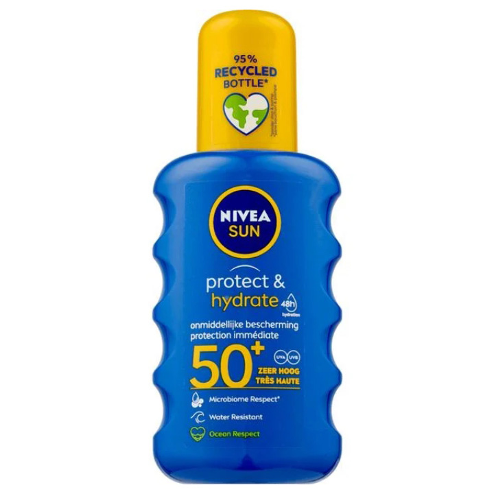
Source: etos.nl
9. Find a balance between visibility, communication, and persuasion for ultimate impact
It goes without saying that with so many elements, it’s hard to incorporate every single detail into your packaging design. However, maximizing the impact your packaging makes on your consumers is possible with the right balance between the three. Two things can help you increase your chances of creating a well-balanced design:
- Identify the specific strong and weak elements of your current design, relative to key competing designs. You can then include these in your design agency brief.
- Adopt a quick ‘design – test – learn’ iterative cycle. Each cycle should be no more than four weeks long. Conduct testing through a single solution that combines behavioral simulation, and implicit, explicit, and visual metrics for a holistic overview of the power of your packaging design.
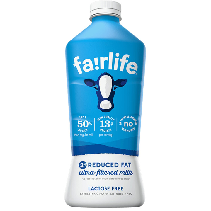
FairLife milk proves to be a terrific example here as its packaging portrays great harmony between visibility, communication and persuasion.
Source: fairlife.com
And there you have it. Nine of our best practices to help your packaging stand out, communicate with effect, and persuade consumers for definitive action. If you want to go a step further and learn more about optimizing your packaging design, check out our ultimate guide or contact us here.


