The PACT series part 5:
Best practices for brand blocking

Welcome to the final blog post in our PACT series: a collection of blog posts exploring key principles of effective packaging design. We’ve already discussed the importance of packaging structure, how to create premium perceptions, the impact of incorporating human imagery, and how to best incorporate your logo in your packaging design.
Last but not least, today we’re examining the practice of brand blocking in packaging design.
What is brand blocking?
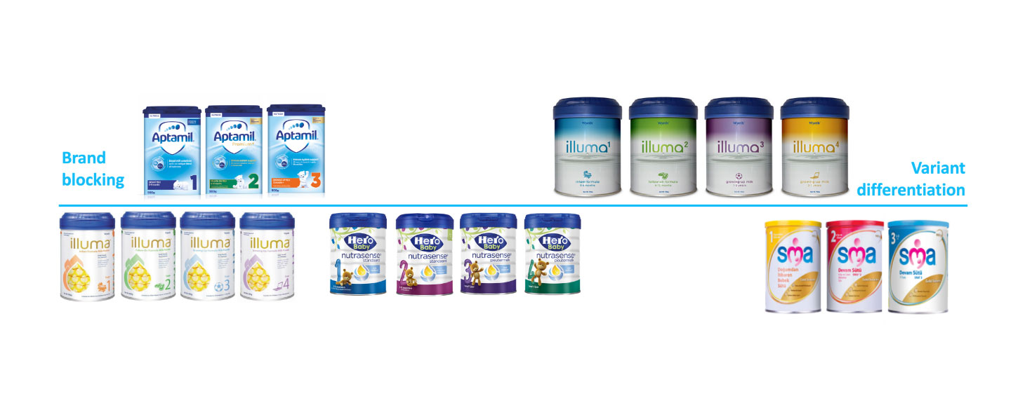
Simply put, brand blocking is the grouping of different products (or variants of a product) from the same brand on store shelves. For example, you might find all Coca Cola products displayed together at your local supermarket. This arrangement creates a section or ‘block’ for brands.
Brand blocking can be a great way to build a strong brand presence, but getting it right is easier said than done. The challenge is that each product variant must strike the right balance between two conflicting design imperatives: unification and differentiation:
Unification: The product variants must be somewhat similar in order to create a uniform brand block that has the potential to be large and, thus, highly visible, as well as to establish a strong presence.
Differentiation: At the same time, the variants must also be clearly distinguishable from one another so that shoppers can easily find the specific variant they are looking for.
Getting it right
Successful brand blocking is a balancing act, requiring an emphasis on both visibility and findability. Too much variant differentiation can take away from the brand block, while too much weight on unification may end up reducing ease of finding.
Unfortunately, in reality most designs excel in one but not the other. We’ve noticed this often in our own testing practices, where for example a new pack design aiming to improving visibility manages to do so, but at the expense of findability (or vice versa).
For example, in infant formula packaging designs, brands tend to use color differentiation to facilitate ease of variant recognition. This creates the risk of a diminished brand block.
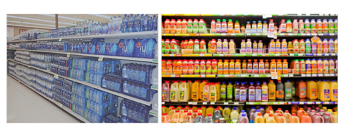
Creating a solid brand block that stands out on the shelf is already challenging, and it’s even more so when it comes to conforming or deflecting from category conventions. In some product categories, all brands within that category tend to conform to category conventions. This makes it even harder to stand out on the shelf:
Of course, you can create a brand block through non-conformity. However, while this does establish a strong shelf presence and stopping power, it does not translate into higher sales. In fact, breaking from category conventions may even instill concerns over product quality.
A great example of brand blocking done right is Jimmy Dean’s frozen meats packaging:
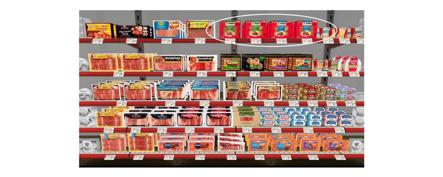
Jimmy Dean’s products, however, successfully manage to differentiate themselves from the other products. While their packaging stays true to category conventions (i.e. the product is visible through the packaging), this visibility is limited – consumers only get a glimpse of the product. This also gives the packaging more free space that is then leveraged to create a strong contrast against competing products (through the use of the striking red color).
That being said, using color to brand block isn’t always effective. If you look at the chocolate aisle at a supermarket, you’ll notice an explosion of bright colors. To stand out in this category, it makes more sense to opt for more muted colors.
Making good use of distinctive brand assets (like your logo) is also key. This combined with smart shelf placement and creative differentiation will help ensure your product isn’t just standing out on the shelf, but also leading to sales.
Now that we’ve explored 5 different principles of effective packaging design, that’s a wrap on the PACT series. But optimizing your packaging design doesn’t stop here. Contact one of our PACT experts today and find out how we can take your packaging design to the next level.


