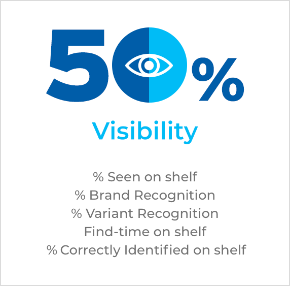
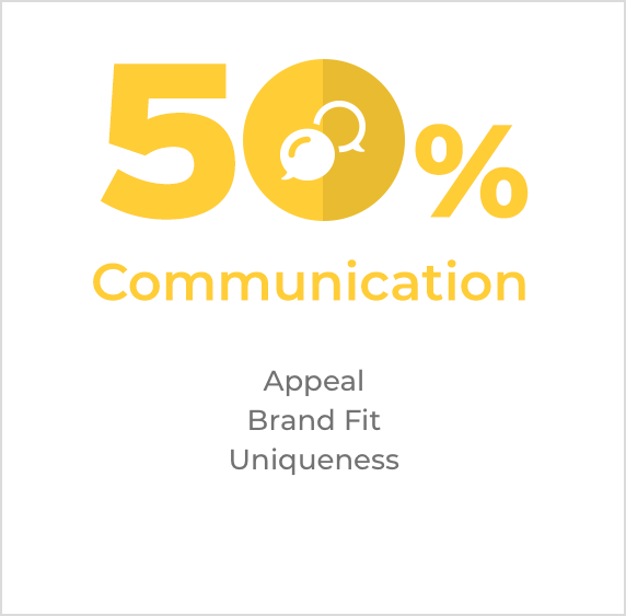
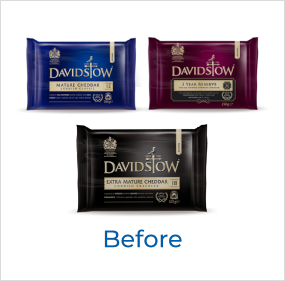
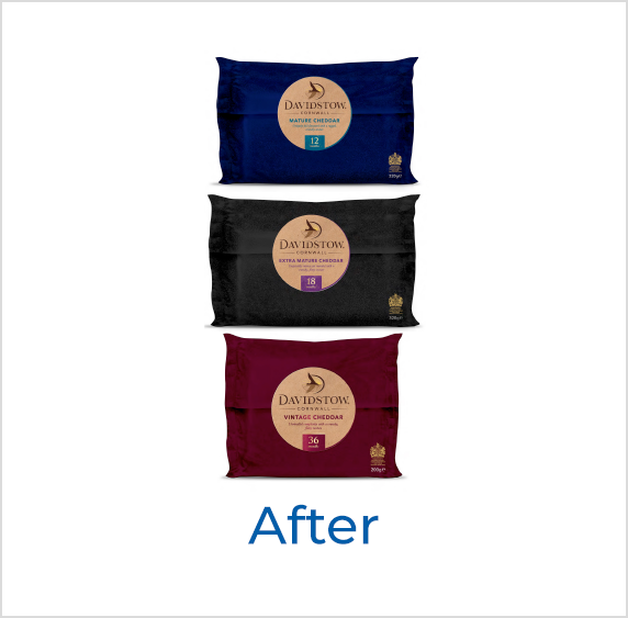
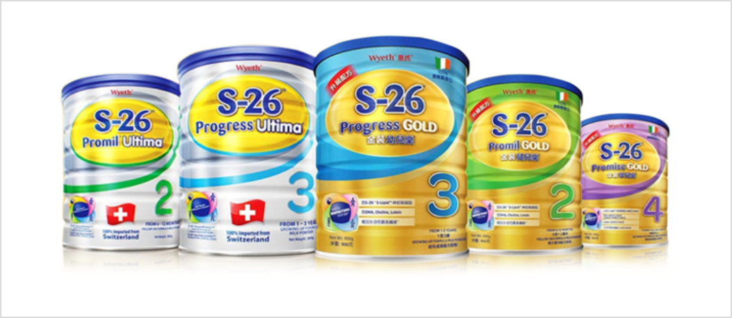
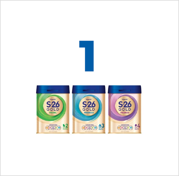
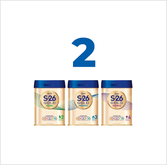
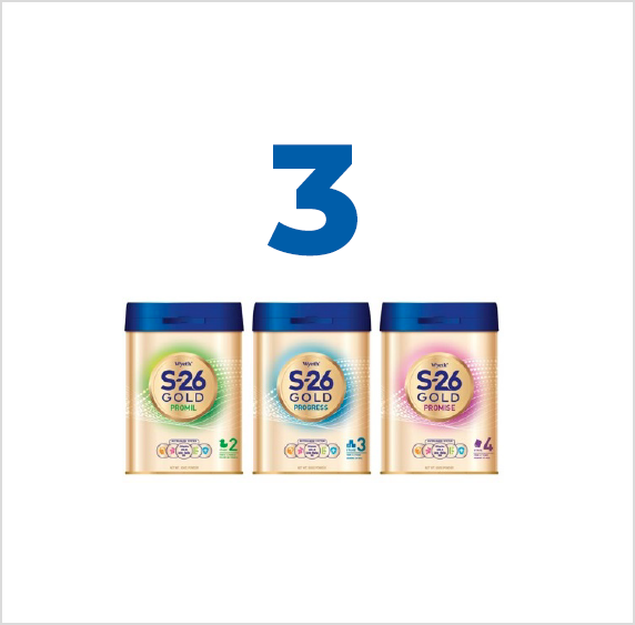
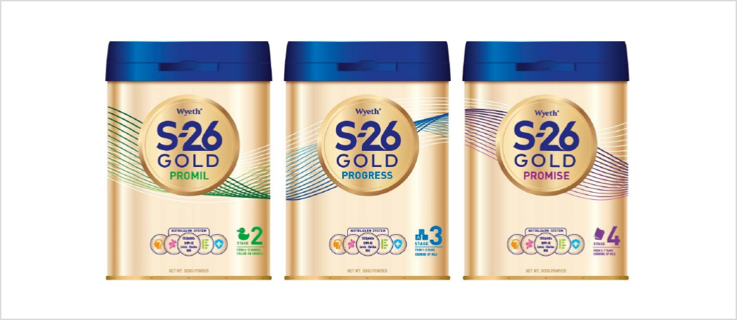
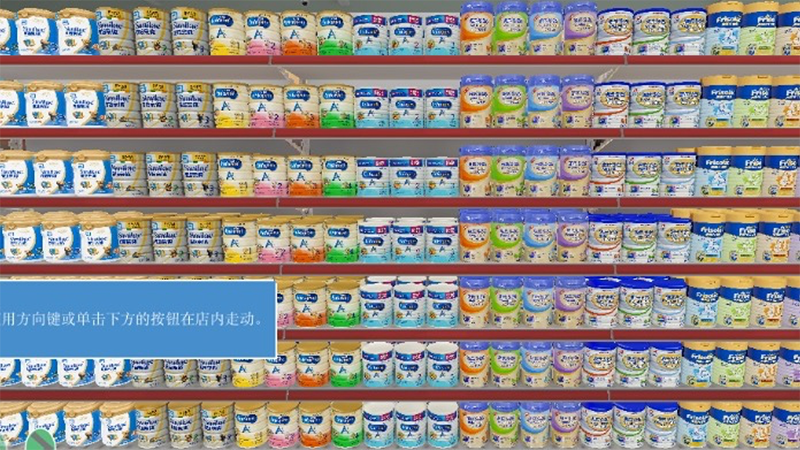
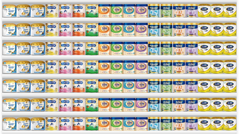
We’re always observing, analyzing, and testing pack design and use best practices to help our clients find success. Alongside Nestlé, our London team examined the importance of package design at a recent conference. We focused on the benefits effective pack design can bring to a brand. We compared the old and new pack designs of Nestlé’s S26 baby milk formula packaging. By doing so, we revealed what made the new design more effective from visual, persuasive, and purchase perspectives. We focused on two topics: Nestlé’s Francky David and MetrixLab’s Claudia Strauss spoke about the importance of strong packaging design. To attract consumers as a fixture, Claudia talked about the fundamental principles of winning design. Francky shared the case study of Nestle’s S26 baby formula. The product’s design and brand blocking were integral in its successful redesign. Check out the video below for the event’s highlights and key takeaways. Don’t want to watch? No worries—we’ve written the takeaways for you. Your consumers use your pack design every day; it is your best source of frequent advertising, so it demands care. Fifty percent of your efforts should go into being seen – no one can consider you if they can’t see you. The remaining 50% must be about making your product more desirable than anyone else’s. Davidstow wanted to create a design that was befitting their premium positioning as an authority in cheddar. The new design used iconography to anchor its heritage in Cornwall. The substrates used were reminiscent of quality cheese stores, not supermarket plastics, and the combination elevated the brand really well. But if we had just reviewed it in isolation, we would have missed its inability to get the right attention in store. Why? Because the brand was still wearing the category colors to denote maturity. Everyone wears these colors, which means Davidstow was no more premium than its nearest rival. Source: Tesco supermarket, UK We discovered that even with beautifully crafted labels and expensive substrates, if you want to be considered differently, you must disrupt norms, not follow them. Source: Davidstow cheddar, UK Nestlé also wanted to premiumize the brand’s S26 milk variant in Hong Kong and China to make it more scientific and impactful on the shelf. The old design showed too much information and had poor shelf visibility. It was hard to find in the store. As such, sales were not as high as they should be. MetrixLab, of course, was on the case. The old design Source: Nestlé MetrixLab tested three new designs for Nestlé. The new design choices Source: Nestlé The second design proved to be the strongest. It cut through clutter on the shelf and was highly visible. It also provided enough information to remain impactful. The design was also beautiful from a coloring standpoint. It was pleasant to look at. It had purchasing power. It aligned with many of the elements of great packaging design. The winning redesign The redesign made it easy for consumers to notice the milk on the shelf. Nestlé had a significant 11-point increase in brand awareness, which is quite good based on packaging change. Brand consideration, which is a key stage for Nestle’, has increased by 10 points, from 40% to 50%. So far, in terms of brand equity, all the markers are on green. And all signs point toward this brand being refreshed. The old brand block Source: MetrixLab virtual shelf The new brand block Source: MetrixLab virtual shelf We have completed almost 4,000 packaging case studies for global clients in the past two years, with a great deal of success. This has allowed us to create a deep understanding of the packaging design process. We have created a great deal of content about getting your product seen, sought, and sold. We’re experts in the field, willing to help in any way we can. Ready to begin creating the best, most visible, most persuasive—and most purchasable—packaging design?
A tight package: the best practices for on-shelf wins at a glance
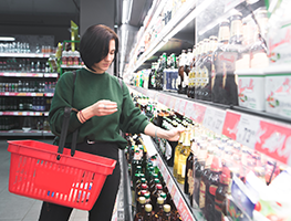
Pack design equals purchase power
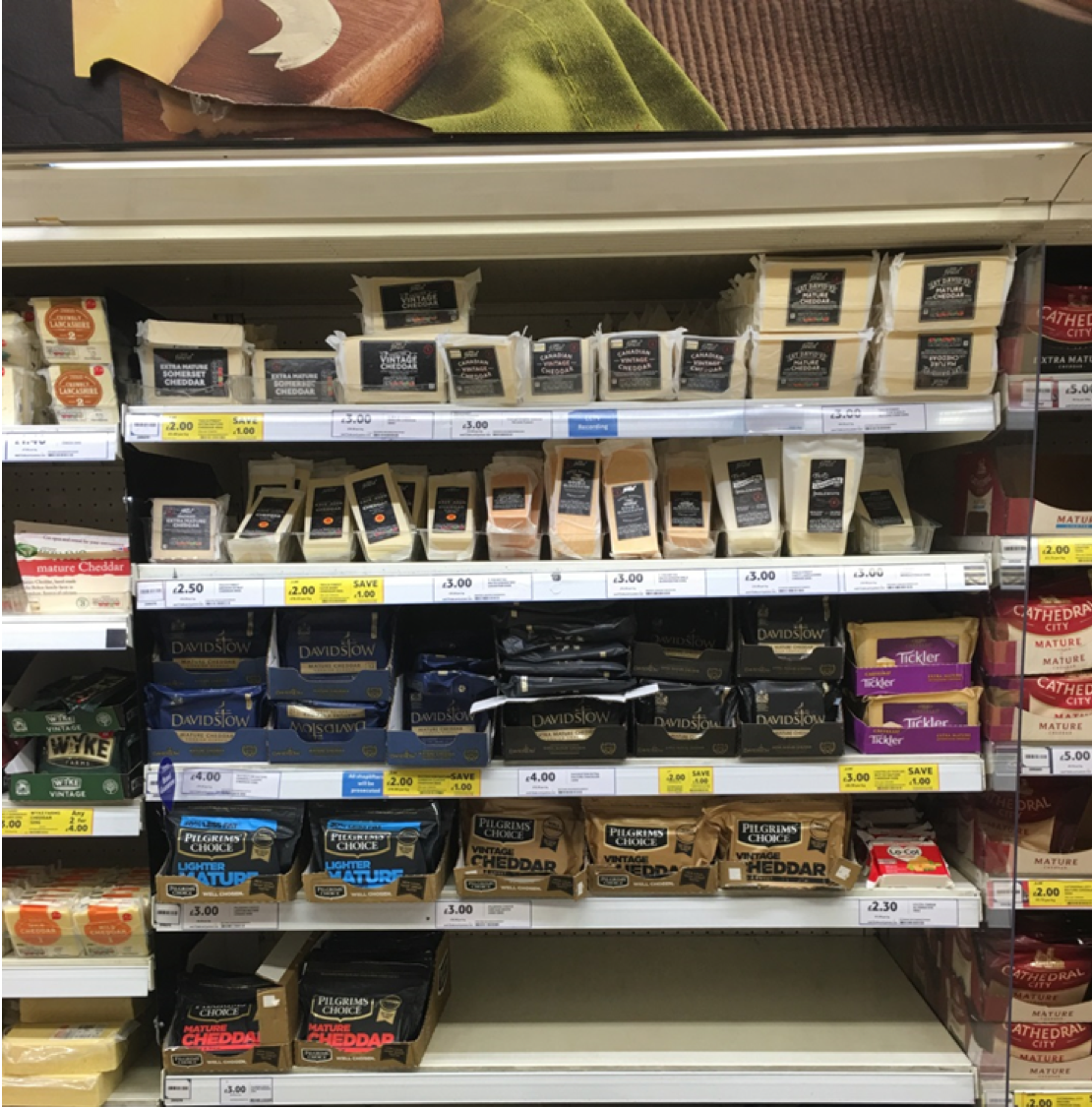
Color coordination and premiumization aren’t (always) a match
The reality of the supermarket shelf: Nestlé’s case story
Choosing the right design
What was the on-shelf impact of the Nestle redesign?
Ready to further unwrap the qualities of effective package design?
We’re waiting for you
Video: How Nestlé applied best practice pack design principles for an on-shelf win — a milking success story


