How can you create more powerful packaging design?

We encounter a lot of packaging in our day-to-day lives, from the trusted brands we know and love to new products that catch our eyes as we walk past them in stores. On any given day, we touch more than 50 different packaging designs.
Your packaging design is a critical brand asset. It is the primary embodiment of your brand. Your pack design can help you best competition on the shelf, as well as strengthen implicit associations and preferences when the product is being used. Packaging also plays a critical role in addressing circularity goals and environmental issues.
This triggers a very important question:
How can you create more powerful packaging design?
![]()
Taking a step back
Two years ago, we published our first meta-learning, providing nine best practice guidelines to creating powerful packaging design. The framework is centered around the central roles that packaging design plays: being visible and findable; appealing to the senses; communicating who and what your product is and why it should be purchased—and being very persuasive, at that.
Nine best practice creative guidelines towards more powerful packaging design
![]()
 VISIBILITY
Use contrast to create stand-out
Leverage (branded) visual assets for instant brand recognition and to facilitate speed of decision making
Unite the line & differentiate the variants
![]()
COMMUNICATION
Ensure that the design contains all the design recipe ingredients
Make sure to follow the recipe and the order in which to add the ingredients
Ensure congruence between visual, structural and textual design elements
Design for what it’s worth
![]()
PERSUASION
Design to both generic main category drivers and distinctive brand choice drivers

![]()
Find a proper balance between visibility, communication & persuasion

The ultimate key takeout was that pack design is a balancing act: Creating a design that is strong in terms of visibility, communication AND persuasion is very challenging.
To better understand how to master that balancing act – and to create packaging design that is truly powerful and strong in terms of the three central roles: visibility, communication and persuasion—we created additional meta-learning.

In our new white paper
we are sharing:

Advanced modeling that quantifies what creates “powerful packaging design”

More granular creative design best practices to optimize those elements that matter most

Practical success and risk factors when conducting a (re)design initiative.
![]()
1. What creates powerful packaging design?
We consistently conduct a great deal of pack designs studies. In just the past two years, we have tested close to 4,000 pack designs—a mixture of existing and new designs, both client-owned and from those clients’ key competitors. We then created a benchmark database of the key metrics that are typically included in a pack design study, giving us the foundation for a quantification of the drivers of powerful pack design.
Our pack design testing methodology captures a mixture of behavioral and stated metrics across the three core roles of packaging design
![]()
VISIBILITY
![]() % Seen on shelf
% Seen on shelf
![]() % Brand Recognition (0.1 sec)
% Brand Recognition (0.1 sec)
![]() % Variant Recognition (0.1 sec)
% Variant Recognition (0.1 sec)
![]() Find-time on shelf (secs)
Find-time on shelf (secs)
![]() % Correctly Identified on shelf
% Correctly Identified on shelf
![]()
COMMUNICATION
![]() Appeal
Appeal
![]() Brand Fit
Brand Fit
![]() Uniqueness
Uniqueness
![]()
PERSUASION
![]() % Picked up from shelf
% Picked up from shelf
![]() Purchase Intent
Purchase Intent

![]() % Purchased from shelf
% Purchased from shelf
The metrics under visibility such as “shelf visibility” or “find time” are passively captured behavioral metrics. The metrics listed under communications reflect generic communicative strength of the design, where purchase intent and product engagement are driven by the specific strength of the way benefits, reasons to believe (RTBs) and the emotive end promise are communicated. The ultimate metric that truly reflects the power of design, however, is sales from shelf.

A regression-type model with “sales from shelf” as the dependent variable gave us this driver model:
Visibility is critically important. Almost half of the strength of a pack design comes from how visible and findable it is on shelf.
![]() 47%
47%
VISIBILITY
% Seen on shelf
% Brand Recognition (0.1 sec)
% Variant Recognition (0.1 sec)
Find-time on shelf (secs)
% Correctly Identified on shelf
![]()
![]() 21%
21%
COMMUNICATION
Appeal
Brand Fit
Uniqueness
![]()
![]() 32%
32%
PERSUASION
% Picked up from shelf
Purchase Intent
Key insights from the model:
Visibility and the combination of communication and persuasion are equally important drivers of powerful packaging design.
![]()
a. Within visibility
the two most relevant KPIs are:
• Shelf visibility
– the ability of a pack design to attract the eye and be seen
• Shelf findability
– the ability of a pack design to be found when sought
These findings have triggered us to dig deeper into answering three important questions
a. How can you create packaging design with high shelf visibility and that is easy to find?
![]()
b. Within communication
at a generic level, we see that design appeal is a critical metric
These findings have triggered us to dig deeper into answering three important questions
b. How can you create truly appealing packaging design?
![]()
c. Within persuasion
we see shelf engagement and desire to purchase are key drivers of sales from shelf
These findings have triggered us to dig deeper into answering three important questions
c. How can you best communicate benefits, RTBs and an emotive end benefit to drive engagement and desire?
![]()
2a. How can you create packaging design with high shelf visibility and that is easy to find?
Strong shelf visibility and findability are extremely important! The top 20% most visible pack designs generate six to seven times more sales from shelf than the bottom 20%. For findability, that factor is five to six times higher sales from shelf for the top 20% most findable, when compared to the bottom 20% least findable designs.
Admittedly, part of that difference may come from having a more favorable position on shelf, having more facings or being a bigger brand with a strong heritage. Regardless, strong visibility and findability on shelf are critical.
So, how do you create designs with strong visibility on shelf?
Strong shelf visibility comes from the combination of having instantly recognizable distinctive branded assets, and a choice of a dominant color that creates contrast with the adjacent products
Looking at the top-performing designs with highest shelf visibility, two creative design practices emerge:

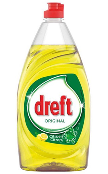
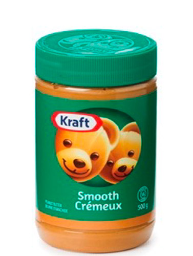
Leveraging instantly recognizable distinctive assets, such as logos, icons, colors or color combinations. We frequently see that a “two-tone” –a combination of two colors as the dominant colors—can be very powerful. Ariel has done this successfully with their choice for green and white.

A choice of a dominant color that creates contrast with the immediately adjacent products, and often a choice of color that pops, that stands out. In this example, interestingly, OMO, Ariel and ALO successfully do this, meaning improving your design’s visibility doesn’t mean a competitor’s design’s visibility will deteriorate. Shelf visibility is not a zero-sum game.
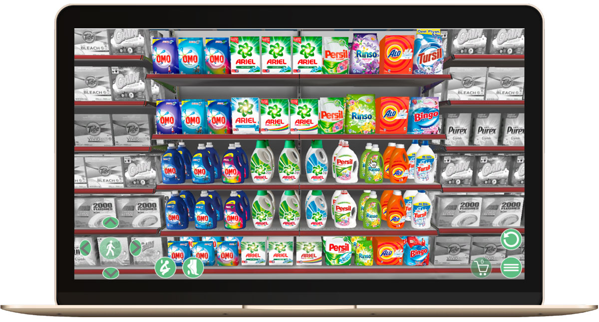
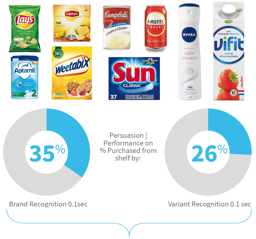
Larger brands with a varied product range will often create a brand block to drive visibility and findability. When we dig deeper into the underlying creative elements, we see that designs with a strong immediate band recognition (within 0.1 seconds) tend to have stronger shelf visibility and findability.
An analysis of the creative characteristics of instant brand recognition reveals that pack designs with strong brand recognition tend to have a large logo or name in the sweet spot—the place where people will typically look first.
Strong brand & variant recognition (T-scope 0.1 sec) helps to make sure that consumers quickly see and find the correct product from shelf

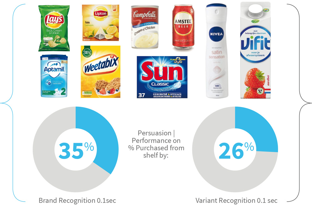
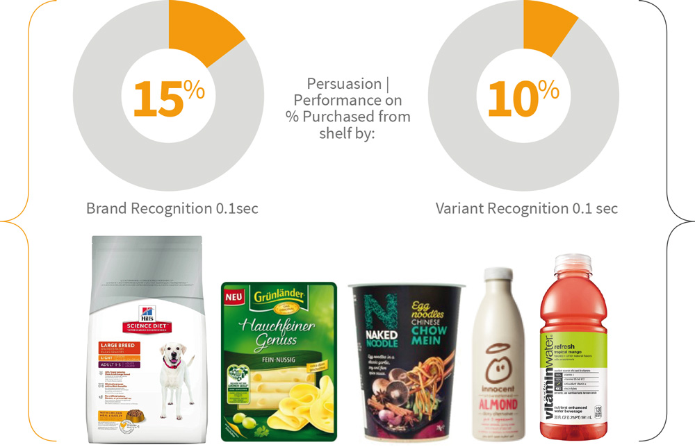
Commonalities:
• In a color that sharply contrasts with the background color
• Placed in a clean design
• Placed in the sweet-spot – at around 25% from the top

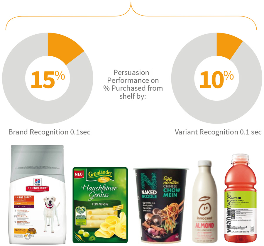
Commonalities:
• Without contrasts with the background color
• Cluttered design
• Placed outside the sweet-spot – on the side, at the top, bottom half or in oblique format
IN SUMMARY, best design practices that create easy and fast brand recognition include:
 Prioritizing logo placement in the “sweet spot” near the top of pack
Providing it with enough space (make it big!)
Ensuring on-pack contrast
Decluttering the space in the logo’s immediate vicinity
![]()
2b. How can you create truly appealing packaging design?
This is a tricky question.
Beauty, of course, is in the eye of the beholder. We have addressed this question by looking at—and trying to identify commonalities among our top 20% most appealing pack designs from the database as opposed to the bottom 20% of least appealing designs.
First, looking at the least appealing pack designs we have tested, some of the creative
characteristics include:
• Lack of emotive elements/overly functional designs (Alpecin)
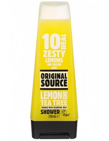
• Out-of-date, unfitting packaging structures (Original Source).
Unappealing color and product visualization
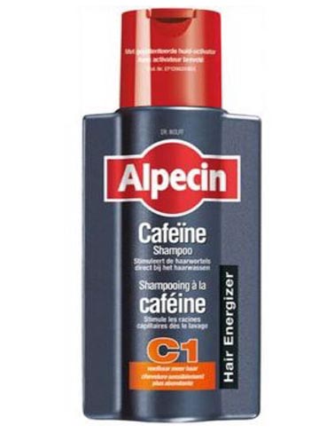
Unappealing combination of colors
Lacking a promise / emotive end-benefit
Unfitting / unappealing pack structure
Creative elements that take away from appeal include unappealing dominant pack colors or color combinations, lack of emotive elements or unfitting packaging structures
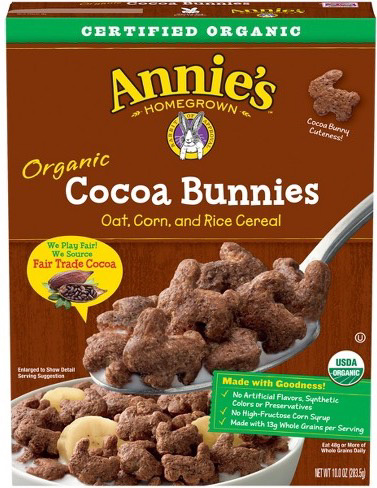
In contrast, highly appealing pack designs tend to have beautiful pack colors that offer a strong RTB or visualization of the emotive end-benefit. Other elements that drive appeal include natural materials, elements that are tempting or indulging and elements that signal premium. There is quite often a “touch of magic” present, or congruent structures that emphasize the benefit.
Appealing colors & natural ingredients
Hair curl symbolizing healthy beautiful hair
Palm leaf and ocean promise moment of bliss
Beautiful color combination & structure
Nostalgia
Happy, healthy child & proud parents
In addition to the iconic color combination, what works well is the ‘burst’ of rays around the logo
The wave embedded in the structure suggests strong cleaning efficacy
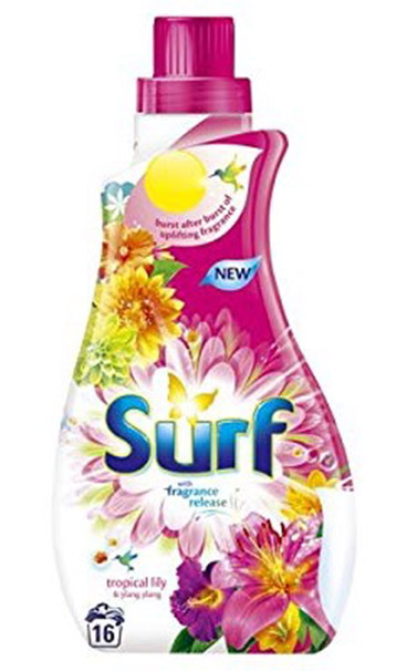
An on-pack explosion of flowery fragrances promised a nice smell
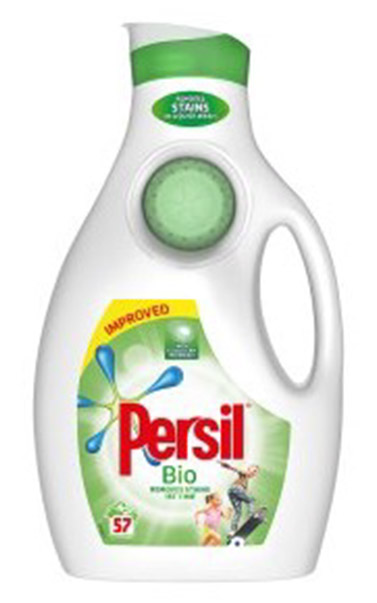
The friendly stain and the playing children scream ‘dirt is good’
IN SUMMARY, these are some of the design tactics that can be used to create more appealing packaging design:
Creating orderly and clean designs by avoiding clutter Following “sectio divina” composition rule (8:5) when it comes to placement of key design elements Usage of beautiful fitting colors or two-tone color combinations Visuals of ingredients that offer a compelling benefit or RTB to emphasize natural, tempting or premium Visuals and photos that (subconsciously) promote the end promise, e.g. of health, beauty, joy or happiness Packaging shapes or structures that visualize the brand promise A touch of magic, such as sparkles, bubbles, rays or swooshes, suggesting a dynamic, active brand![]()
2c. How can you best communicate benefits, RTBs and an emotive end benefit to drive engagement and desire?
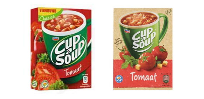
When it comes to communicating benefits, one of the most common tactics is to name the product/variant after the key benefit, for example:
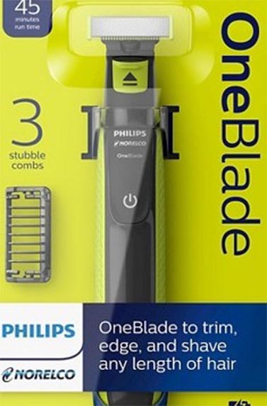
OneBlade: one blade that trims, edges and shaves any length of hair
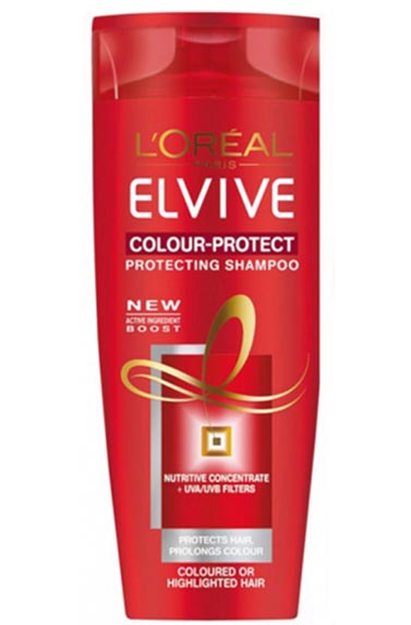
Elvive Colour-protect: protects coloured and highlighted hair
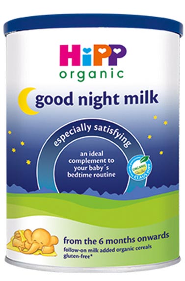
Hipp Organic: all their products are organic. Good night milk: for a good night’s sleep
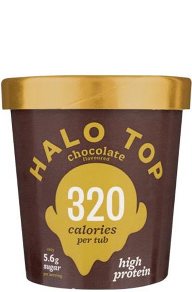
Halo Top names each variant after the calorie count of the variant: 320 is the number for the chocolate variant

An effective way to communicate a key product benefit is by naming your product/variant after the benefit
Products with one or more strong functional benefits typically leverage a clear, short and simple visual communication style. Especially the communication of dual or triple benefits requires creating clarity — visually and in the language used (short and simple)
A benefit that negates fear or a negative outcome, is visualized as if it as a warning sign
Dual/triple benefit communication requires creating clarity – visually and in the language used (short and simple)
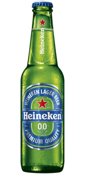
The 0% alcohol benefit is cleverly communicated in blue (signaling rationality, clear headedness, not containing alcohol), in the shape of a 0
Products with one or more strong functional benefits typically leverage a clear/short/simple and visual communication style
Specific to RTB communication, on-pack visuals provide credibility to the benefit. This is accomplished, for example, by showing ingredients, the end product or the end result
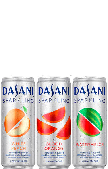
Dasani sparkling is naturally flavored sparkling unsweetened water. The fruit visuals add strong credibility
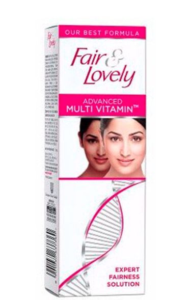
The advanced, expert positioning of Fair & Lovely is made more credible by the DNA string visual
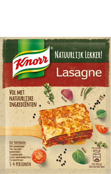
The natural goodness of this lasagna is made credible by the ingredients and finished lasagna visuals
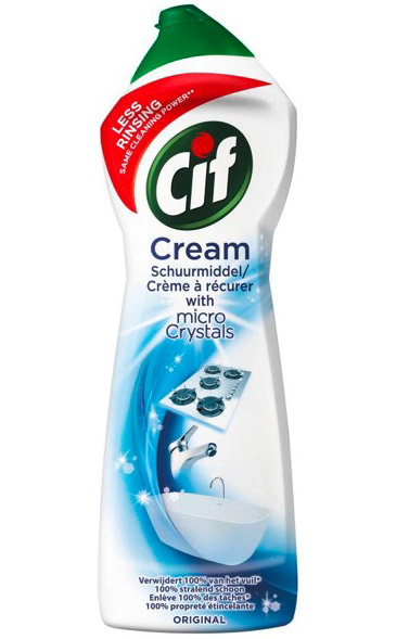
The visuals of shiny kitchen and bathroom appliances make the benefit of micro crystals credible
On-pack visuals provide credibility to the benefit by showing ingredients, the end-product or end-result
Finally, creative design elements that can deliver a promise or emotional end benefit often include visualizing people and iconic symbols.
The promise of beauty, glamour and success
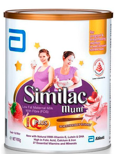
The promise of a happy, healthy baby
The promise of a smooth, wrinkle-free life
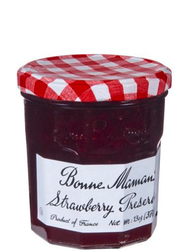
The promise of French home-style quality and authenticity
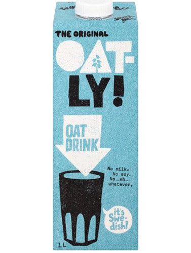
The promise of Swedish wholesomeness
Creative design elements that can deliver a promise / emotional end-benefits include visualizing persons and iconic symbols
In summary, design practices that have the potential to create strong persuasion include:
![]()
a. Benefit communication
• A product or variant name that represents the benefit
• Concise benefit claims (very few words), possibly augmented by an icon or bullet point
• Icons, emblems or symbols that emphasize a benefit (efficient, powerful, dynamic, easy, fast)
![]()
b. RTBs / credibility communication
• Images or transparent (see-through) pack materials that reveal the product
• Images that show ingredients, the end product or the end result
![]()
c. Promise or emotional end benefit communication
• Images, pictures or abstract visuals that reveal the emotive (see-through) end promise
• A distinctive pack structure (shape and material) that subconsciously conveys the promise
• Design elements such as shine, gloss and/or darker colors (e.g. purple, black) that emphasize premium

![]()
Overall
• Optimizing the visual hierarchy:
communication of benefits before RTBs before the emotive end promise
![]()
3. Practical success and risk factors when conducting a (re)design initiative
Now that we have uncovered the key drivers of powerful packaging (and some of the best design practices that will help to create it), we will take a look at the success and risk factors of packaging redesign initiatives.
3a. Risk factors of redesign
In the past two years we have conducted close to 1.000 projects in which new designs (typically two new designs) were tested, against the current design and two key competitors as benchmarks.
When we compare the average aggregate performance of the newly created designs with the current design, we tend to see that new designs struggle most with retaining shelf visibility. This, in turn, has a direct negative impact on engagement (picking up a product from shelf) and penetration (purchasing from shelf). This is a problem, as we demonstrate (in chapter 1) that shelf visibility is an extremely important driver of shelf sales. This is all the more reason to recognize shelf visibility as a critical KPI that should always be included in packaging redesign tests, with action standards set as “parity” or “must win.”
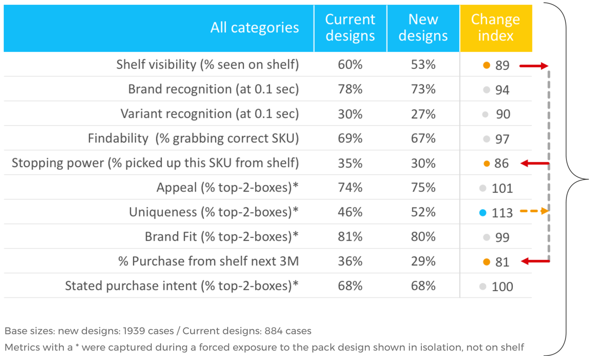
In restage situations, new designs tend to struggle with retaining shelf visibility, with a direct negative impact on engagement and penetration
3b. Risk factors of a disruptive redesign
We also looked at the risk level associated with specific design changes that are more revolutionary in nature (as opposed to evolutionary). This is because pack design owners often struggle with finding the right balance between revolution and evolution. It is only through revolutionary design changes that you can hope to significantly increase your customer base and attract new customers. Evolutionary change, however, typically offers the best guarantee of retaining your current customers and the lowest risk of alienation.
Logo design change
On-pack visual change
Changing size/place of logo
Dominant color change
What is the risk level associated with disruptive design changes
We discovered that a design change that comes with a particularly high-risk level is changing the design of your logo. Changing the dominant color of your design also comes with elevated risk. All other more revolutionary design changes, such as changing your on-pack visual a benefit claim or the shape or size of your packaging are less risky.
To be clear—this analysis is about variance. It is not necessarily a bad idea to change your logo. The analysis does reveal, however, that a logo change has the potential to very significantly impact (upward or downward) your shelf sales. That variance, and thus the risk level, is more moderate for all other design changes. The higher the risk level associated with a particular design change, the bigger the imperative for conducting a design test. Going with a revolutionary or disruptive design is proven to be a high-risk, offensive strategy—one possibly more for challenger brands than market leaders. Respecting and nurturing the distinctive assets of market leading brands is critical, particularly the logo, the pack color and on-pack visuals.

A design change type with a particularly high risk profile is changing the logo
3c. Risk factors of redesigning an iconic design
Our clients are often market-leading brands, with very strong, iconic packaging designs.
The problem with iconic designs is that they are very difficult to improve upon, and often should be left alone.
We often see, however, that brand and pack design owners don’t realize they are managing an iconic design. When we look at the test results of an iconic design, we find that the design is already so strong on all metrics that it would be difficult, sometimes even pointless, to attempt to improve it.
We recommend brand and pack design owners is to first establish the equity of the current pack design. To determine whether a pack design is iconic, the design owner must determine if the design significantly outperforms the two closest direct competitors on all key metrics related to visibility, communication and persuasion.
An iconic design outperforms its two closest competitors on visibility, communication and persuasion
A good example of an iconic pack design that meets this definition is SAVO, which outperforms its closest competitors on all key metrics.

SAVO outperforms its two closest competitors on:
• Appeal
• Benefit perception
• Sales from shelf
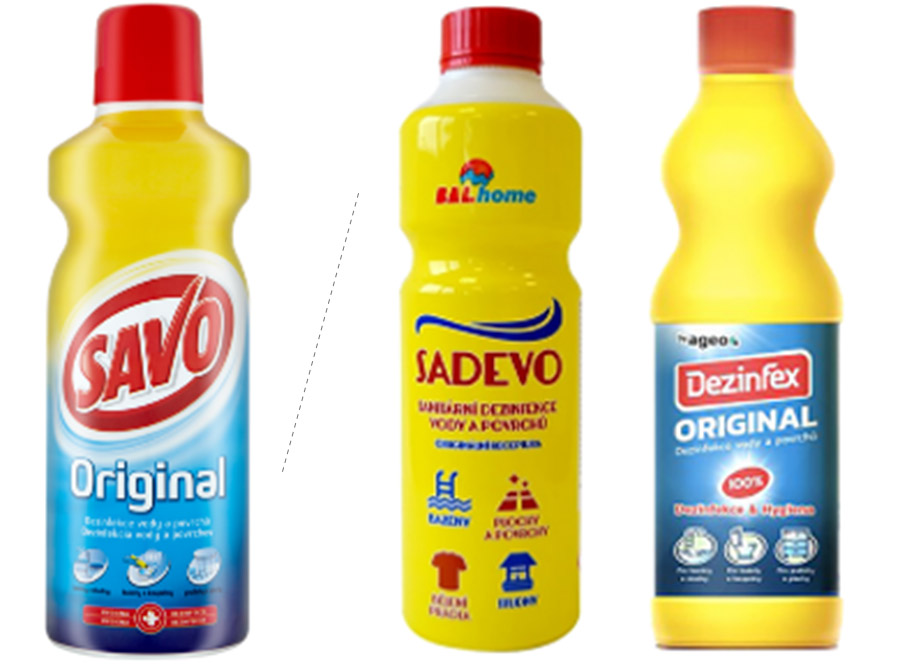
ICONIC DESIGN DEFINITION: The brand is market leader and the design significantly outperforms the two closest direct competitors on visibility, communication and persuasion
The first step is to determine if your current design is iconic
Iconic designs should be well-guarded, and changed only for good reason. One such reason could be to keep the design modern and fresh.
In our tests of iconic designs, the perception of “modernity” is typically the first and often only attribute we see moving. For this reason we have added “perception of modernity” as a standard KPI to all our packaging design tests.
A nice example comes from Häagen-Dazs, with nine years of evolutionary changes that have kept the design fresh and contemporary.
We recommend considering alternative action standards for iconic designs in restage situations. We recommend considering setting an action standard on modernity (seeking a significant improvement), with all other metrics remaining on par.
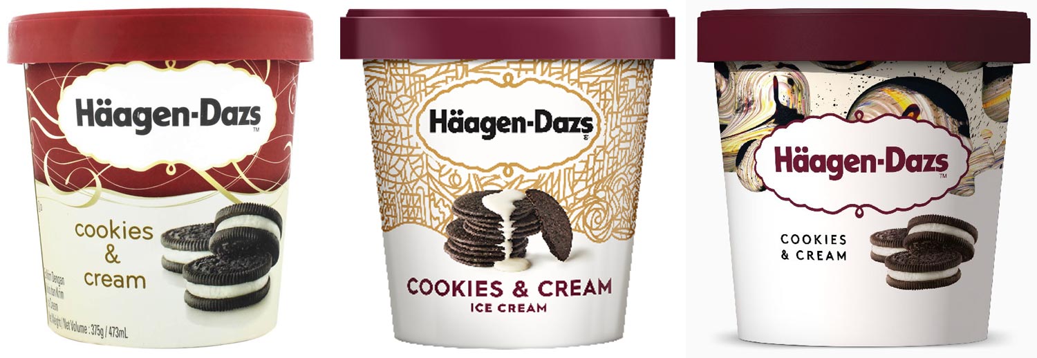
Häagen-Dazs pack design between 2010 and today – evolving modernity
We often see that redesigns of iconic packaging show an uplift on ‘modernity’ first – and sometimes only on modernity
Summary of risk factors from design initiatives
In summary, we recognize three types of risk factors one should be aware of when considering a redesign.

a. Shelf visibility is a metric that is typically negatively impacted the most in redesigns. This is a problem, as shelf visibility is a critical driver of the power of a pack design.
•The implication is to always include shelf visibility as an action standard in pack design tests and be prepared for new designs to fail on this metric.

b. From all the disruptive design changes that are possible, a change of your logo design has the highest risk/reward profile.
•The risk from disruptive design changes can be properly managed through extensive testing. A disruptive design strategy is possibly better-suited for challenger brands as opposed to market-leading brands.

c. Iconic pack designs are difficult to improve upon, and as such ambition should probably be limited to keeping the design fresh and contemporary.
•The implication is that you must first know if you have an iconic design or not. Depending on the answer to that question, you should set your redesign ambitions and associated action standards accordingly.
Author

Alexander Kleijngeld
I&S Practice Director


